Shonky: The Aesthetics of Awkwardness
The Mac, Belfast, 20 October 2017 – 14 January 2018
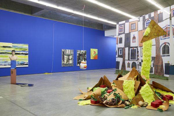
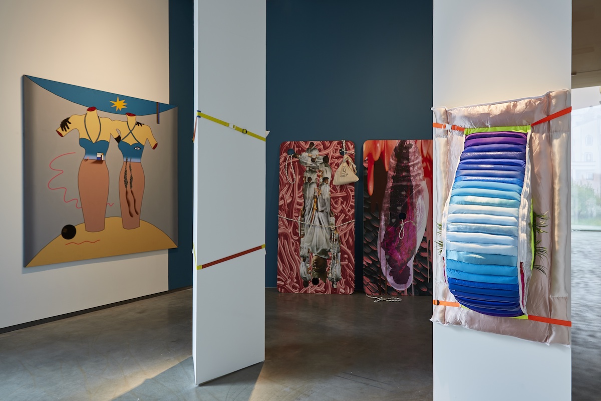
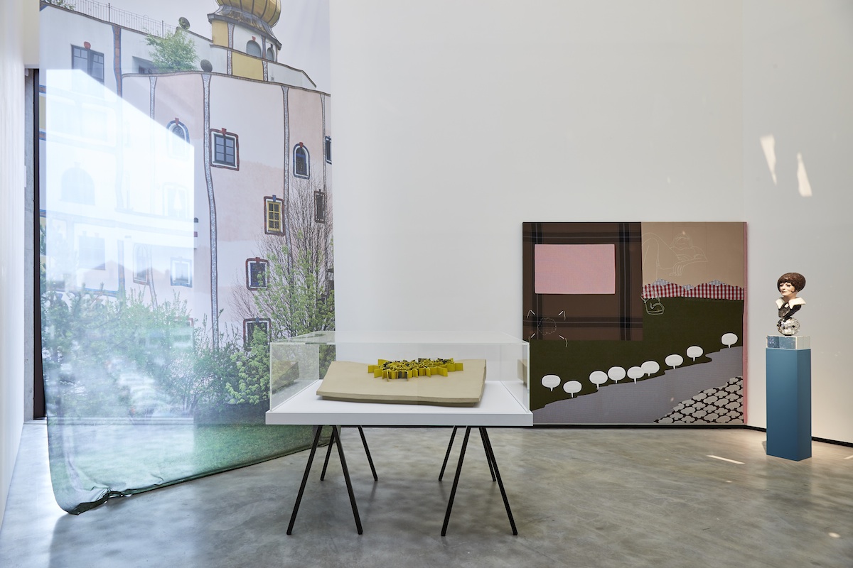
There is an air of challenge in this raucous hodgepodge of quirky and carny art. Shonky: The Aesthetics of Awkwardness, curated by artist John Walter, presents the work of artistic outliers ranging in time from Niki de Saint Phalle’s Mini Chameau of 1970 to Justin Favela’s hot-off-the-press Floor Nachos (created on-site during the set-up of the show). In addition to the significant span of time, we are offered the full gamut of contemporary media including video, sculpture, performance, painting, and kinetic art. So, the show is certainly eclectic, yet it does gel. It is drawn together and unified by its conceptual underpinning.
Walter presents Shonky as a “way to question the cultural status quo”. Fair enough – but this begs an obvious question – exactly what cultural status quo is being questioned? The contemporary art world is pluralistic, it’s various manifestations displaying at best a Wittgensteinian family resemblance. So, we could easily identify a whole clan of related but distinct ‘status quos’, at least one of which is represented by centers of contemporary culture like the Mac and the exhibition’s sponsor, the Hayward Gallery. But this show doesn’t embrace the sort of reflexive irony that would allow it to target its own host. Rather, the targeted status quo is identified as one that specifically showcases qualities of competence, refined taste, and slick production values.
If we travel across Belfast to the University district we can find an example of what Shonky might be aimed at. The Royal Ulster Academy 136th Annual Exhibition at the Ulster Museum is a celebration of cultivated taste and competent, sometimes masterly, facture. The Royal Ulster Academy of the Arts is certainly part of the status quo; it provides an annual platform for its established membership and a gateway for the aspiring artist. It would be reasonable to say that taste, skill and quality are essential touchstones, both for the election of the academicians who have a permanent right to exhibit, and for the selection of works from the juried open invitation. It is an exhibition that is easy to appreciate. In the words of the RUA promotional video, the pieces “hang harmoniously together”; there is an air of comfortable familiarity about the work, with few surprises (and absolutely no shocks).
Although the RUA show concentrates on the more traditional media of painting, sculpture and drawing, it displays almost as varied a selection as Shonky (no performance art as far as I can tell). The submission rules require that the work is recent, but although the pieces are physically new, the stylistics are typical of the last century or so, either in pure or in hybrid form. The styles range from realist atelier-style painting like Catherine Creaney’s This Too Will Pass to video such as Vince Rovolo’s Step up. Like Shonky, the RUA show is eclectic, and yet in the end it also is unified, but this time by reference to mainstream historical continuity rather than a polemical concept.
Actually, Shonky can claim its own historical lineage. Its forebears in the twentieth century include the Dadaists of the twenties and the Pop Artists of the sixties. We can also trace influences of the absurd as typified by figures like Jarry’s Père Ubu, and of the provocative wit of Duchamp’s urinal with its dribbled ‘R Mutt’ signature. We can even link it up with popular cultural movements like Punk and Grunge. But in the end, it is the (anti) aesthetic of Dadaism that most obviously resonates. The initial impression on walking into the Tall Gallery is of a sort of Day-Glo Dada (Walter even claims Kurt Schwitters as ‘the shonkfather’). An air of Dada-esque rejection of respectability and reason permeates the exhibition. The performance piece from Plastique Fantastique would surely not have been out of place in the Cabaret Voltaire, and we can conjure an oblique reference to Jarry from some of Kate Lepper’s hanging shapes, at least one of which displays the Ubu spiral emblem.
But Dada’s raison d’être doesn’t really apply in today’s heterogeneous art world – there is no historically dominant aesthetic to trash. The contemporary art market is culturally and commercially voracious – it feasts on iconoclasm like Cronus munching on his children – so artistic challenges cannot outlast their own infancy. Even the barbed zaniness of Shonky is born without teeth, it creates its own shonky orthodoxy by being defined and branded and, if it survives birth, will merely append to the canon rather than challenge or question it. That is, if it is not merely abandoned on some lonely cultural hillside to expire.
It would be inaccurate and unfair to treat Shonky as simply an attack on a contemporary establishment. Its promiscuous, aggressively carefree use of cultural sampling is both a means to an end and an end in itself. It delivers, I propose, an image of our web-driven zeitgeist where content overwhelmingly consists of idiosyncratic and mostly partisan mashups and appropriations of pre-existing videos, images and texts and where production values are decidedly shoddy and amateurish – and by extension it also delivers an image of our increasingly absurd lifeworld of fake news, conspiracy theories and socially fragmenting identity constructs, a lifeworld that the web echoes and ceaselessly reshapes.
Walter uses the term ‘maximalism’ to characterise his work (we can almost see ‘minimalism’ inscribed on the wall of a white cube in cool sans-serif with ‘min’ scratched out and ‘max’ scrawled in bright green marker). Maximalism, if we take Shonky as an exemplar, is a philosophy where fecundity trumps refinement. And the oblique reference to minimalism is not without significance. Minimalism, among other things, is an aesthetic of Zen-like simplicity – it has spawned a style of decor that promotes uncluttered clarity and yields a sort of stripped-down industrial elegance that can all too easily slip into shallow slickness. Shonky maximalism is the opposite; in terms of decor we could liken it to a fluorescent (and efflorescent) splurge of Victorian bric-a-brac, but much less orderly and a lot more morally permissive and artistically aggressive.
The packaging of Shonky is a shade self-conscious – from the ‘awkward’ shapes of the floor labels, to the use of a specially created ‘shonky’ font. The accompanying catalogue makes a stab at embodying shonkyness (in part by using this font). But it wimps-out somewhat in its glossiness and rather tame compositing. Compare it with the anarchic Oz magazine from the late sixties and early seventies (much more shonky in thought, word and deed, and incidentally, birthed in Australia like the term ‘shonky’ itself), and we can’t help wondering why the catalogue’s producers didn’t go the whole hog and emulate or, better still, out-shonk the magazine. But we need not ponder for long. This is a consciously curated show, and the act of curation, as well as embodying an informed or committed perspective, must also be an act of packaging – of branding. The packaging of Shonky betrays a tension between the avowed values of shonkyness and the requirements of contemporary art venue presentation, requirements that entail the very values that shonky sets itself against.
As a project, Shonky is consciously and technically conceptual. The curator quite deliberately offers us a newly minted category for art. One that, positively defined, would embrace among other things the provisional, the ephemeral and the absurd. He deliberately fleshes out this artistic concept by gathering and displaying shonky exemplars from the last half century, and by repurposing the slang term for ‘shoddy’ or ‘awkward’ as an art label. In a section of the catalogue (“The Shonky Factor”), he even augments his ostensive definition by assessing the shonkyness of an additional forty or so well-known artists in a playful, ad hoc (shonky) way. An interesting effort at engineering or socially constructing a concept.
It is tempting to think that the RUA show and Shonky mark two extremes in the art world, but the situation is more nuanced than that. The geographic spacing of the two shows could form a metaphor for their actual relationship. Picture the boisterous cacophony of an exuberant horde from the north of the city marching on the quiet, orderly gathering of a family of aesthetic siblings in the south to, you know, shake them up a bit – only for the latter to extend an invitation to the least unruly marchers to calm themselves, sit down, and join the family.
There is a concept from the study of cellular automata known as ‘the edge of chaos’; it means a region of bounded instability. The gist of the idea is that the most fertile state of any system is one where neither permanent stability nor random flux dominates. It is this region that is most fertile, being neither stagnant nor chaotic. Shonky, if it defines itself on what it is rather than what it is not, can certainly claim a place in this region, and so can the RUA exhibition, providing it doesn’t rely too exclusively on established taste and slick production – and in the end, they can sit rather easily side by side within an expanded cultural status quo.


