 |
| Gary Shaw: The Color in my Painting by Josef Albers (detail); courtesy the artist |
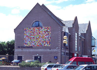
North Down Borough Council has exhibited art on gables of the buildings near the sea harbour twice before: for example, last year Peter Richards installed large pinhole-camera prints of people from the area.
In Gary Shaw’s case, the artist selected ten smaller abstract paintings to be printed on mesh and attached to the lightposts along the North Pier, and one larger one to be displayed on the gable of Bregenz House.
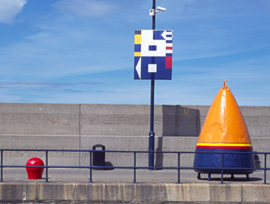
Recognised by the Inter-Governmental Maritime Consultative Organisation in 1967, the standardised system of communication, ship-to-ship and ship-to-shore developed over some hundred years, became Shaw’s chosen ‘material’. Josef Albers used to encourage young artists to “find out what [the material] is able to do by presenting it with a new function." Shaw changed at least three rules in relation to the material: (1) the system invented for a necessary purpose with minimal ambiguity is, in this particular instance, unnecessarily duplicating the ordinary alphabet; (2) a group sharing knowledge of that system, i.e. a minority of the public, becomes a structural ingredient of the artwork whereas the rest of the public cannot be that; (3) the timespan appropriate to the flag signals has been replaced by static notation with a prescribed duration, guaranteed not by the receiver but by the durability of the technical means. All three are paradigmatic shifts.
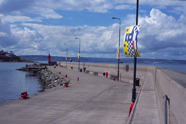
Shaw attached the smaller images on mesh to the lampposts at two points only. They behaved a little like sails moving in response to the wind. Their sensuality loosened the tie with art and indoor culture, an issue researched patiently before by, for example, Ulrich Rückriem (1938 – ).
 |
| Gary Shaw: Landscape (detail); courtesy the artist |
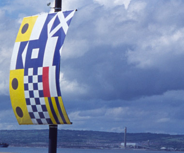
Signal-flags communication is as exact as Morse code; each letter has a precise and unique constellation of shapes and colours. Shaw used the exactness of such an alphabet and painted the rectangular grounds with descending, cascading patterns of the repeated word, e.g. ‘landscape’, ‘avant-garde and kitsch’, ‘postmodernism’, ‘content’, etc. The Golden Thread Gallery exhibited many of these paintings in May 2004. The image on Bregenz House is an enlarged copy of one of them. The ten smaller images on the North Pier are of details of different paintings in that show.
Supported by Peter Richards and Gail Prentice, the artist put together a display that reconstituted the pleasure principle. The Monday afternoon of the launch we had a pleasant gathering of people, sunshine and sailing boats, as well as unexpectedly quiet seagulls. The gentle sound of the wind and sea capably drowned the noise of not-so-distant roads, allowing art and nature to be in a rare harmony.
A harmony shot through by several paradoxes. With a sense of fleeing, the abstract paintings / prints assign themselves to Modernism, which includes a certain reflexivity. However, the images are words in a code – if you know the code, i.e., you have previous knowledge, you can read them as you can read an alphabet, azbuka or Arabic script.
An example will perhaps illustrate better how these paintings are made: I take a word: ‘LAND’ becomes:
LDNA
ALDN
NALD
DNAL
Each letter is assigned shapes and colours.
The paradoxical relationship of dualities governs the correspondence between the look and the meanings.
The selection of words, the coding system, colours, shapes, are ‘found objects’ under the complete control of the artist. Once the choice is made, he is enslaved by the system and structure, like a robot filling in the compulsory fields. The result may appear chaotic at times.
 |
| Gary Shaw: I am a painting (detail); courtesy the artist |
Shaw chose words from the discourse on Modernism; consequently the relationship with it may prove important. Inter alia, it resonates with “Nothing is positive about art except that it is a word, " stated by Willem de Kooning in 1951 (see H. Chipp, Theories of Modern Art, 1968, p. 556).
I was given two clues: one is the text on Bregenz House, a passage from Josef Albers’ (1888 – 1976) The Colour in my Painting , the other is a passage at the end of E. H. Gombrich’s (1909-2001) Illusion and visual deadlock in Meditation on a Hobby Horse, 1971, pp. 151 – 161.
Albers maintained that colour deceives continually; he also was an advocate of serial painting, devoting nineteen years to squares. In that he echoes Cézanne’s (1839-1906) commitment to Mont St Victoire – 250 paintings are extant.
Shaw adopts a salient Modernist attitude in his research-like mode, keeping strictly to varying one element only, the word. The painting on the gable looks like a messy swirl of small coloured shapes without any order. After a while a suggestion of a grid appears, running under cover once the eye focuses on details. It is near to Mario Merz’s (1925-2003) application of the Fibonnacci sequence, except in Shaw’s painting it is not a mathematical abstraction but common words. I thought of it as a montage that uses all the letters of a word, indicating a final solution only to undermine it by the dropping letter in each row, thus forming diagonals of sameness.
Shaw uses colour with confidence and differently from his earlier work – a demand issued by Albers, who also recommended simplicity and activation of space by colour.
Gombrich deals with this issue in more general way:
Critics wrote and still write as if we could see both the surface and the representation, but artists knew better. Their rebellion against illusion came into the open more than fifty years ago in those conundrums of Cubism, which lead our eye a frustrating chase after guitars and bottles, teasing us with false clues only to entrap us in contradictions. It was by exploring these paradoxes that artists wanted to discover new modes of organization.
What paradoxes does Shaw explore? I mentioned two of them above: the controller becomes controlled, word becomes an abstract image. The next one lies in using the keywords of Modernism as if in fascination with it or in critique of it, making the choice impossible by denying legibility. The ambiguity of what we see is fatally powerful with or without previous knowledge of the maritime signalling code.
Consequently, art is given the task of limiting the spectator’s response either to the appearance alone, or to the mercy of insignificant associations, which beautifully undermines instrumental function. Art instead frames discovery and invention powered by imagination by making equivalent ‘correct’ and ‘incorrect’ (another paradox).
Not its appearance but the capacity of the chosen ‘material’ to fool us, deceive us, seduce us and enchant us while not pretending anything at all gives the work its strength and beauty.
 |
| Gary Shaw: I am a painting (detail); courtesy the artist |
This is more apparent in the ten smaller compositions, which are enlarged prints of details of ‘word-paintings’, like close-ups in films. Here they support the illusion of being whole by humorous undercover sensibilities. Partly, these relate to Modernism – Albers, Klee (1879-1940), Scully (1945- ) are the nearest examples – partly they deny the Modernist project by replacing an ‘inner image’ by a mechanically constructed one.
Both attitudes are convincing and false simultaneously – the paradox between what they are and what they look like.
Yet there is no conflict or tension between the two – only a double-faced joy. This is a new take on reflexivity. In addition, it is a celebration of ‘mute poetry’ that has to communicate, like the maritime code, visually only – over not a small distance between self and the Other.
These paintings are witty. I recall Motherwell’s comment that “it is sometimes forgotten how much wit there is in certain works of abstract art" (see H. Chipp, Theories of Modern Art, 1968, p. 562).
Continuing the Modernist project by presenting it with another function, in this case pleasure (paradoxically enhanced by the frustrated ‘reading’), Shaw adds the Dionysian accent to its Apollonian principles. The site, the harbour, feeds the intoxication as well; nevertheless, the wish to “wed oneself to the universe" (Motherwell, ibidem, p. 563) is inescapably in the images themselves.
The ‘antinomy beings’, which the images are, challenge the lazy submission to prejudice, by which I mean making a judgement before seeing ‘the phenomenon’ properly. But we cannot do that at all easily. Shaw insists on the disappearance of the Modernist keywords in the signalling code, as phenomenology insists on the ‘epoché’, a suspension of belief. However, the words are all there physically on the picture plane. The last paradox lies between that and all the above.
Slavka Sverakova is a freelance writer on visual art.
Gary Shaw: Art On The Seafront , Bangor, June – August 2004