 |
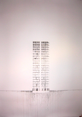
Felicity Clear, Macken 2 , graphite and acrylic, courtesy The LAB |
Felicity Clear’s Place(s) without place show at The LAB consists of large-scale pencil and acrylic images depicting urban scenes and buildings. The pieces are hung on the wall using large bull-dog clips hooked on nails in the wall. This mode of presentation perhaps suits this work better than other uses I’ve seen of it, but it is a method that has been overused and gives the work an unfinished quality. A large-scale drawing of a building on display in the lobby is the first introduction to the exhibition. The colours are kept to a minimum; only greys and beiges are used. The drawing is akin to an architectural elevation. It is a strong graphic piece and shows a tall narrow building’s skeleton minus its exterior skin. I wish this approach had been examined elsewhere in the exhibition. The technique most commonly used by Clear is to draw a building in the centre of the page and surround it with a “painted luminous vivid sky." [ 1 ] The use of such strong, solid colours against detailed and delicate drawings drowns out the intricacies of the graphite.
 |
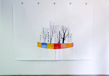
Felicity Clear, Citadel, graphite and acrylic, courtesy The LAB |
Citadel is the largest image on display in the exhibtion; measuring 195 x 282 cm, it commands your attention as a result. Its approach also differs from the vivid skies depicted in the other works. Behind brightly coloured hoarding rises an abundance of contemporary urban developments; these are set against the silhouettes of skeletal winter trees. The paint from the individual blocks of hoarding drips down the page and down the gallery wall, suggesting it was painted in situ. The strong colours are kept to the lower part of the image and the graphite is given room to breath in the vast white space remaining on the canvas. The containment of urban sprawl within these walls with their injection of colour is reminiscent of the rainbow-themed playgrounds overshadowed by large apartment complexes in inner-city Dublin. The location that first springs to mind is the renovation of the playground on Gardener Row, which is just around the corner from The LAB. I found the decision of The LAB in showcasing Clear’s new work an astute one, given the nature of her work and the location of the gallery.
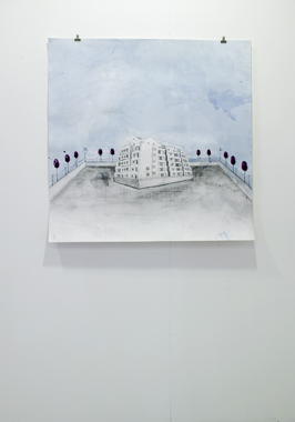
Citadel II lacks the impact in aesthetic and content of Citadel . The notion of the citadel is apparent but the image is too small in scale for the size of the canvas and I had trouble with the quality of the execution. As for the building on show, I feel it neither questions the use of urban dwelling nor displays the artist’s competence as a draftsperson, a competence which is apparent in other pieces on display. The perspective of the drawing is off but not distorted enough to raise any questions in regard to urban dwellings. Information accompanying the exhibtion informs us that Clear’s work represents an otherworldly approach, one “of real buildings made strange." [ 2 ] This otherworldly exploration is hard to find; in fact I found the work to be not strange but surprisingly mundane. Basin could be seen to be the piece that tries to show this building made strange approach in the forefront, but I was not convinced by it. What results is an askew perspective – again, the perspective is not distorted enough to give it meaning – on a pier surrounded by water. The citadel approach is examined here, but I don’t find that the resulting image works.
 |
Felicity Clear, Basin, graphite and acrylic, courtesy The LAB |
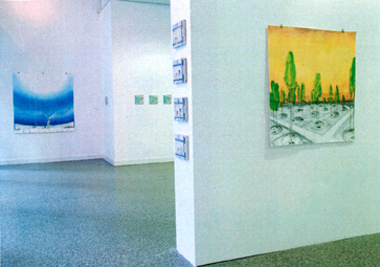
The statue of the Winged Victory of Samothrace is the focal point of Antigone . Again the vivid sky is present in this piece, its strong cobalt blue varying in intensity as it draws the eye up to the heavens. The viewer looks over the outstreached wings of the statue of the godess of Victory onto her domain below – Clear has restored Victory to her original location of an open-air amphitheater. The scene depicted further explores the story of Victory decending from the Heavens to take her place among ‘the Sanctuary of the Great Gods’, which accounts for the dominance of the sky in the piece. Clear titled this image Antigone, the daughter of Opedius, and whilst the image references a Greek mythological character, Antigone is not the one and the title is inexplicably misleading.
 |
Felicity Clear, Instalation Shot at the LAB featuring Antigone, Boy multiple, Chinese girl multiple and Untitled, courtesy The LAB; photo Michael Durand |
Alongside the large-scale images on display are a series of multiples – small-scale canvases – depicting the same scene again and again. The series entitled Boy multiple and Chinese girl multiple consist of five and four images respectively. I found they conflicted with the rest of the exhibition, as they are tightly cropped, voyeuristic scenes whose focus is on the character in each. There are very slight variations in each scene and we are told that this is in an attempt to create “a sense of déjà vu." [ 3 ] I don’t believe they achieved this aim, one which I would like to see expanded and explored further. This work jarred for me amongst the large-scale graphic images.
I am unclear as to overall message of the exhibition. Ideas and approaches conflict and, whilst it is apparent what the artist is working towards, I was not persuaded by the execution of the pieces. Little gems do shine out, but I felt let down so badly by other work in the exhibition that I found it hard to see them for what they are. The promise that I felt was offered when entering the lobby is unfortunately not followed through in the rest of the exhibition.
Laura McGovern is a photographer practising in Dublin.
1 Exhibition Handout
2 Exhibition Handout
3 Exhibition Handout