 |
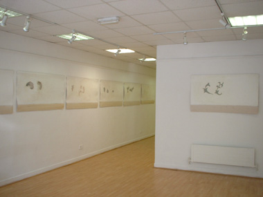
| Ronan Smith’s exhibition, Design for Plate , Signal Arts Centre, Bray; photo the author with permission of Signal Arts Centre |
In the Victorian era, rooms paraded print upon print, mostly in garish colors, and the advent of machine-made wallpaper put the cabbage rose and arabesque patterns within the budget range of practically every home. Artisans such as Louis Comfort Tiffany and William Morris and their lyrical interpretations of nature, hand-printed by the wood block method, came to symbolize Art Nouveau. [1]
It is arabesques, cabbage roses, flourishes, swirls and stylized representations of nature that are the visual ideas developed in Ronan Smith’s latest exhibition, Design for Plate . Different designs or motifs are taken out of their original context (wallpaper) and blown up to be re-evaluated in a new context (art). Smith writes in his material that the work is about the process of deriving and asks how he can “contribute to the development of a style?" To answer this, he seems to have endlessly reproduced and developed the swirls and decorations of the art-nouveau style and isolated them on large expanses of white.
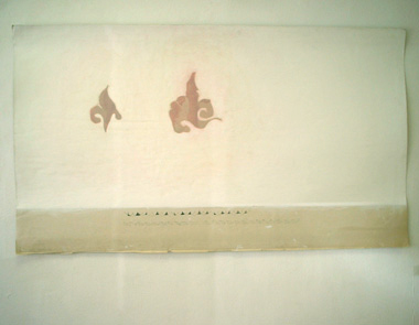 |
Ronan Smith , Untitled , 2004, acrylic and gesso on newsprint; photo the author with permission of Signal Arts Centre |
This painterly exploration of art-nouveau floral motifs and wallpaper patterns through paint is mainly informed by the artist’s experience working as a housepainter in Galway in the months after finishing his degree, and also by a trip to Prague where he familiarised himself with the work of Alphonse Mucha. As with his previous work, in this series Smith is concerned with sourcing an aesthetic from daily life and using the visual information provided by this as his starting point. Being a housepainter gave the artist access to the intimate setting of the suburban home, where the floral motifs abounding in different wallpaper designs provided the basis for an enquiry into a kind of pseudo art-nouveau aesthetic.
The format for the work is undoubtedly informed by the same Victorian, house-based aesthetic; divided up into sections which mimic blank walls and skirting boards. The paintings resemble both worksheets and walls, referencing the dual processes of devising and looking which are taking place within the work.
By the beginning of the 1800s, dividing the wall into three parts – the dado, filler and frieze – became fashionable. Borders differentiated each section, which bore distinctive yet interrelated patterns. This style is often seen in Victorian homes. [2]
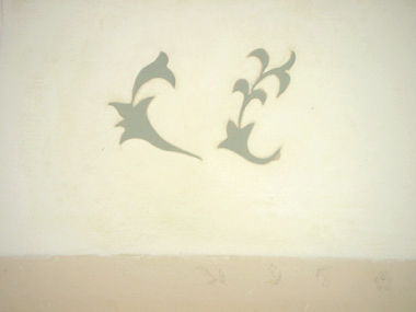 |
| Ronan Smith , Untitled (detail) , 2004 , acrylic and gesso on newsprint; photo the author with permission of Signal Arts Centre |
The paintings themselves are done with acrylic on sanded gesso surfaces painted over layered newsprint paper. This use of paper, and the small pencil designs featured in the unpainted sections of the paper, contribute to the viewer’s sense that they are looking at something in progress and not fully developed – a worksheet, or a sketchpad. This reflects the artist’s assertion that, as “designs for plates," these works are “seen as a stage of process in the production of the Art/Craft Object." The surfaces created with these materials are highly evocative of peeling paint or wallpaper; domestic, worn, white, familiar. They are very quiet works. Here, visual noise is reduced so that the barest elements of art-nouveau shapes can be seen for what they are; which is decoration.
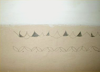 |
| Ronan Smith, Untitled (detail), 2004, acrylic and gesso on newsprint; photo the author with permission of Signal Arts Centre |
What is intended by this attempt to “question the formulized aesthetics of decoration through observation" beyond simply producing more aestheticised decoration is not entirely clear, and this gives the exhibition a sense of being conceptually undeveloped. But the paint itself is sensitively handled and there is elegance in these pared-down representations of art-nouveau motifs. In breaking down familiar shapes like this, Smith has made them simultaneously more primitive and more stylised, and it is certainly relevant to be creating work which addresses the ongoing dialogue between art and design.
First you need to understand that there is a difference between art and design: Design can be considered a form of art, but is probably the most widely used and important form of visual art there is. Design is making stuff look good. Making a good design is a very serious thing. It can be realistic or abstract. It can be simple or complex. In the end though it has to have an effect on the viewer. A sign of of a good designer is that he can cause the viewer to feel what he wants them to feel. Design is used in advertising and web page interfaces and silverware. Design is everywhere…Art is the whole of all visual creations. A man throws paint on a canvas and calls it art. This sort of art aggravates me, but that’s how it is and I can’t do anything about it. [3]
In translating these motifs, which ordinarily belong to the realm of design, into the medium of paint, Smith has enlivened them; perhaps this is his “contribution to a style?" On the white surfaces, stripped of other information, the motifs become sensual and organic, referencing not only the flowers and plants from which the images were originally derived, but also offering a more decadent sensory engagement than that given by something very slick or pristine. The uncertainty in the pencil markings, the bare sections of paper, the slightly creased edges and surfaces together suggest something more than the wallpaper of a home; something more like the home itself. This reading of the work is only confused by Smith’s texts which discuss the paintings in terms of their being “interventions into the production of a consumable object." presumably in reference to how the visual ideas could become finished designs on plates. But in attempting to weave some kind of conceptual idea about production into this exhibition, Smith undermines the presence of the paintings themselves, hung unframed, naked and sensitive, that are what make this exhibition worth seeing and which communicate what words never can about where we live and what we see.
 |
| Ronan Smith , Untitled , 2004, acrylic and gesso on newsprint; photo the author with permission of Signal Arts Centre |
Felicity Ford is an artist and writer based at the moment in Killiney; she currently has her Sound Art piece, Audicle, on show in the Dún Laoghaire Graduate showcase exhibition, and has been invited to show the work again in the Soundworks sound-art festival in Cork at the end of June. She was recently involved with arts-and-theatre collective Spacecraft on their production, Bleeding the System, and performs as part of a cabaret act regularly in Dublin.
[1] Taken from: http://www.wallpaperinstaller.com/wallpaper_history.html
[2] Taken from: http://www.history-magazine.com/wallpaper.html
[3] anklenut, entry in www.everything2.com page on art and design