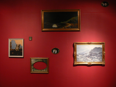
The Golden Thread Gallery has moved to the Switch Room, near the Flax Arts and on the other side of the dual carriageway that passes near the UU campus and the proposed new development. The last exhibition at the old site was devoted to painting only. Its curator, the gallery director Peter Richards, issued an invitation to five very different painters, whose MA graduation ranges from 1991 (Dougal McKenzie) to 2006 (Benjamin de Búrca).
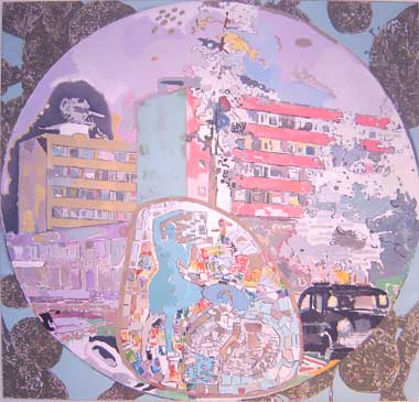 |
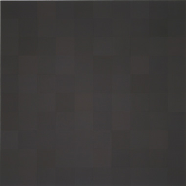
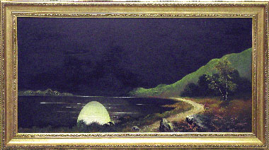
| Dougal McKenzie; Diseconomies of Scale (they pretend to pay us and we pretend to work); 2005/06; emulsion, charcoal, green/ black chalkboard paint, collage and oil on linen; 140 x 140 cm; courtesy the artist. |
Visible from the entrance, three rectangular canvases (2005 / 6) by Dougal McKenzie, each with an inscribed circle, defined a mood well known from the gentle tonality of fin-de-siècle French painters like Vuillard and Bonnard. Light bleached volumes that became suggested more than defined in the manner of some Scottish painters like W McTaggart (1835-1910), without his heavy dark hues. The three narratives are not straightforward; it is easy not to read them as narratives. The fragmentation and skids of scale nevertheless insist on being distant relatives of films, where panorama gives way to a zoom that forges an out-of-focus large detail. Cars become smaller than furniture, a head of a Russian bojar looms over a park with tall trees, a family looms large in a fragmented vista. The monstrously large vine leaves and fruit fill the corners between the inscribed circle and the rectangle of the canvas with a feeling of ‘terribilità’ known to me from classical paintings of biblical stories. The circles then contain the fragments of towns, high rise buildings, bridges etc, of different scales and puzzlingly submissive to the frame, in a manner of medieval illuminations. Although McKenzie knows the narrative painting’s devotion to clear light and closed form, he replaces them with an open form, a form with holes and a rather foggy light. There is dust and fragile boundary between figure and ground in many places; it reminded me of the peeling façades in Venice on a dry, hot Biennale day. Thus these paintings are honestly western, openly holding to the good tradition of painting, yet insisting on their difference. Visitors joyfully commented on recognising a detail, e g a head, a hand, a table, etc; the narrative representational force was obviously working. These are not the big, baggy novels of Hogarth; yet, they invite you to return for more, to pick up another detail. Subtexts are not easily caught. The titles are laconic and ironic: in Peace and prosperity, a head from Russian folklore looms large over an empty contemporary park.
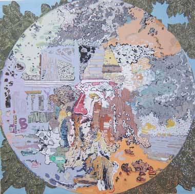 |
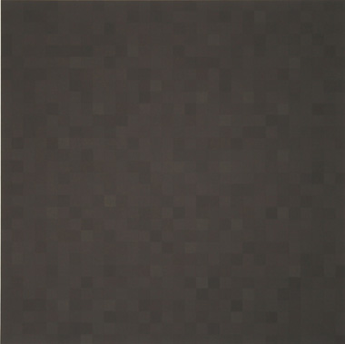
‘Dougal McKenzie; Peace and Prosperity; 2005/06; emulsion, charcoal, green/ black chalkboard paint and oil on linen; 140 x 140 cm; courtesy the artist.
|
|
|
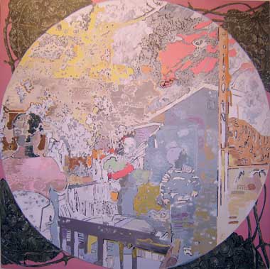 |
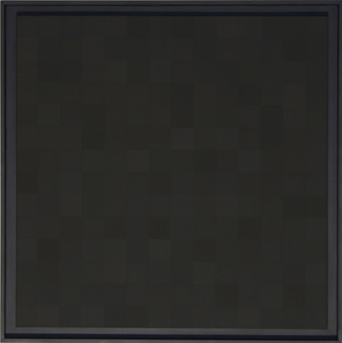
‘Dougal McKenzie; ‘ A Tiger from Socci, 2005 / 06, emulsion, charcoal, green / black chalkboard paint and oil on linen, 140 x 140 cm;; courtesy the artist
|
|
|
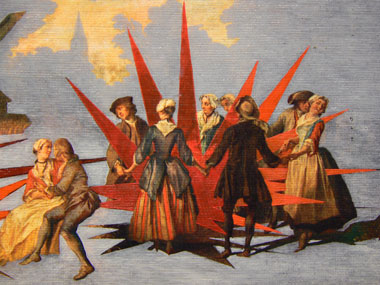
On the wall on the right, they hung a huge canvas in high key and the high temperature of yellow tones; it trumpeted a very different energy: childlike abandon, teens obsession, and adult commitment vied for that greater deal in Mark McGreevy’s 20,000 suckas to the bottom of the nugget (2004). What does it mean? I e-mailed the painter and he explained: “The title is a slight comic variation on 20,000 leagues to the bottom of the sea . I was really looking for something more similar to a H G Wells story, but I used Jules Verne instead; there were several reasons for this: Captain Nemo’s ship is free of governmental ownership and has the freedom to roam the seas, which he does so, in the name of science but also his human frailty gets the better of him and the mission becomes one of the revenge…”
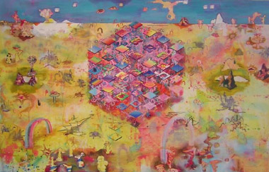 |
| Mark McGreevy: 20,000 sucka’s to the bottom of the nugget, 2004, oil on canvas, 195 x 300cm; courtesy the artist |
This surprised me – a morality tale, in shapes and colours of brash fiction, that advertises the forte of teen culture with its noise and thought poverty? The multitude of forms, namely of three forms, offers surprisingly complex keys: First: there are numerous ‘rainbow shapes’ starved of rainbow colours and tossed across the vast area of the canvas. “As a young boy (even now) I would play computer games for hours bordering on addiction and in one of these games the protagonist has to use rainbows to escape dangerous foes…also (it is) used as a weapon like a multicoloured laser…” As a straightforward borrowing from popular culture, the motive deserves attention also for its capacity to spread the energy of a rhythmical repeat all over the ‘landscape’. On a deeper level, it reaches existential fear through religious belief: “I enjoyed connecting with the more traditional image of a rainbow…as a covenant between Christians and God… I think that there could be a sense of an implied threat…it is a reminder of the deluge that went before, an afterimage of a violent act.”
Connecting personal memory with cosmology opens the dual character of the chosen sign, the rainbow in this case. Consequently, it is significant that not all of the rainbows have the correct number of colours. From the point of view of the reflexivity of modern painting, the ability to make a sign for a phenomenon by subtraction, reduction or negation of a dominant characteristic acts as evidence for this painter’s strength as well as for the perceptual skids and shifts that dominate our cognition.
Second, at the top of the canvas McGreevy placed numerous cubes spaced at irregular intervals and moving in the same direction. They animate within a split-second and this illusion lasts, oscillating between peaceful landing and an attack. Third, in the middle of the composition a blue isometric design has not quite decided between anchoring and floating, thus forging a state of mind that transfers to the viewer as disorientating or disorientated.
Powerfully, narrative is created by free-floating loans from popular culture to issue a deep sigh that utopia cannot be constructed.
 |
| Gary Shaw; Crown, 2006, dispersion on canvas, 91 x 91 cm; courtesy of artist |
 |
| Gary Shaw; Blue square, 2006, dispersion on canvas, 91 x 91cm; courtesy of artist |
 |
| Gary Shaw; Romeo, 2006, dispersion on canvas, 91 x 91cm; courtesy of artist |
Gary Shaw allows his compositions to reflect on patterns he sees on tile floors of the Crown Bar in Belfast, or other places. He calls his technique dispersion: “I mix my own paints using a liquid pigment in copolymer dispersion.” The image consists of small rectangular fields of colour, either one hue or different hues connecting with each other in a grid. It is labour-intensive work – no gesture or intuitive brushmarks are allowed, no emotionally charged brushstroke, divided or otherwise. The composition is a world coming into existence as the painting progresses to its complete state. This in turn is severely regulated either by a reminiscence of a pattern (never a repeat of one) or by some linguistic rule facilitated by a ‘sign language’, e g flags. Surprisingly, there is energy, even joy radiating from the disciplined act that never dims one’s spirit. Its distant relatives are Arabic tiles and Aboriginals’ Dreaming; however, it is of now and here, and quite confidently so. On the way to become a proud being, the painting devours some of the Modernists’ theories, such as conceptual art, abstraction, geometric especially, that sort denounced with so much passion by Kandinsky. Shaw’s is a ritual of veiling – in older work a decorative appearance hides literal citations from books; here it breaks the inspiration into bits, thus hiding it from a view. He lets the ‘seed-of-zero’, i e the tile on the floor, generate the painting or paintings in a process similar to the generators of random numbers in computing. Shaw playfully allows some grid in, while equally playfully corrupting it in each of the 91 x 91 tiny squares. How? By subverting an order or by letting each column of squares descend differently and in different colour.
 |
| Charles Walsh; Abstract painting # 7, 2006, oil on linen, 152 x 152 cm; courtesy of artist |
 |
| Charles Walsh; Abstract painting 900 , 2005, oil on linen, 152 x 152 cm; courtesy of artist |
 |
| Charles Walsh; Abstract painting 100 , 2006, oil on linen, 152 x 152 cm; courtesy of artist |
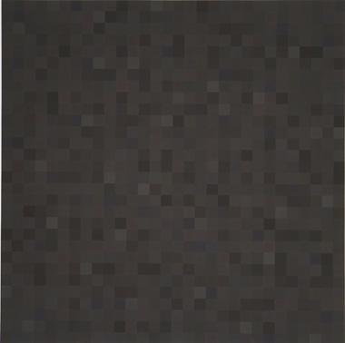
Grid gets a robust defence in the superb black paintings by Charles Walsh. His is not a laissez-faire aesthetics that sets any experience with a work of art as equal to any other. Large black squares stand alone, yet they are participatory in a particular manner: if an object has power, silence can be the only true commentary. In that sense, my interpretation, my breaking of the silence, is a brave attempt. More so, because of my sympathy with Oscar Wilde’s paradox “the mystery of the world is visible."
 |
| Charles Walsh; Abstract painting #6 , 2006, oil on linen, 152 x 152 cm; courtesy of artist |
 |
| Charles Walsh; Abstract painting 196 , 2006, oil on linen, 152 x 152 cm; courtesy of artist |
Three of the canvases are made up of 900 squares each, one canvas from 100 squares. It does not work as a conceptual shift; in perceptual terms, however, the different scale of the grid elements points to some difference in the way colour defines space.
The artist states on his website that “colours give space.” This may be an illusion of depth or an illusion of separation, e g the red standing in front of the picture plane. Neither applies here. Nevertheless, the colours in each smaller square appear more active, agitated, and dynamic, than in larger squares. The painting with one hundred squares has slower silence. In all, several colours couched in the black are visible and appear randomly distributed. However, Walsh has been doing research in pigments and painting methods, and in answering my question he wrote: “They are not random, each colour is considered in relation to the next, within a ‘900 square’ canvas I usually begin with one of the four centre squares [The canvas is positioned horizontally and the painter can comfortably reach its centre, thanks to his physique]. Then I select the colours. [In the preparatory stage he makes a working drawing of a grid with symbols for the colours’ distribution]. These can be Ultramarine blue – light and dark, Alizarin – light and dark, the Cadmium colours from deep reds through to pale yellows, Caput Mortuum, Bohemian green earth, Vermillion, Naples yellow and many more.”
 |
| Charles Walsh, installation image Seed of Zero; GTG 2006; courtesy the artist. |
I hasten to add that Walsh makes colourful grids as well as these ‘black paintings’ – the delight lies in the presence of all the above-mentioned and -unmentioned colours in both sets. While it seems paradoxical in theory, vis à vis each small field the eye cherishes the whispers of different hues in the embrace of the black as if in a comforting nursery. Not only is there not a conflict; both the single colours, some so complex that they do not have a name yet, and the black work in unexpected harmony. The quality of pigments is extraordinary. “All paints are freshly made, hand ground, each pigment has its own particular characteristics. Some are short (requiring little oil), others can be stringy. You see since the standardisation of oil paints in the nineteenth century, by the addition of waxes, fillers and stabilisers, the very nature of paint has changed, and in turn has changed the nature of painting itself. Most paint manufacturers and customers look for uniformity in handling…The pigments I use have a history.” For oil, whose colour depends on where it is grown, Walsh prefers “the German cold pressed variety.”
What to make out of his devotion to matter ordered in the system of repeated squares? The key idea is space – Plato understands it as a receptacle in which things come to be (see Timaeus, 52b). Space is a peculiar being because it has such overwhelming neutrality, due to which it can accept any form that happens to occupy a location at a given time. Plato denies that space is separate from matter – yet it is that which matter does not occupy. Physics deals with the interaction of space and matter; its wisdom is not helpful for these paintings. The pigments are analogues to Plato’s matter, the black is to space. The physical world is the world of becoming, and in agreement with that thought Walsh works the pigments to become themselves to a degree that can be registered by the eye – but no more than that. It is as if the pigments were on the brink of leaving their formless material existence and not quite resolving what form they wish to be. These moments of birth insist on the authenticity of not-yet-full being, in the next second maybe, the promise saturating each field with joyful energy as well as scepticism that will turn any categorical statement into an implicit conditional. The eye freely roams across the surface, connecting the subtle existences into different temporary assemblies. The experience is as near a jouissance as it is highly charged with doubts.
 |
| Benjamin de Búrca; from Journey’s end; courtesy the artist |
 |
| Benjamin de Búrca; from Journey’s end; courtesy the artist |
The reflexivity of painting is given another form and appearance in the installation by Benjamin de Búrca called The Journey’s end . Is this installation of paintings an analogy to the play of that title, a classic WW 1 drama by RC Sheriff? In it, a young soldier is trapped in the war, between a father figure and an innocent youth, metaphors for love and friendship. Sheriff considered calling the play Suspense and waiting – which fits the state of mind before a work of art is exhibited to the unknown audience. Being an artist asks a person for a great deal of courage, and encouragement from older or younger friends – so some ideas are shared between the play and this installation, even if not intentionally. In a light-hearted way, the title may be a simple statement about the painting reaching some kind of end. Nine framed reproductions of older paintings were painted over, scribbled over, cut and pasted.
 |
| Benjamin de Búrca; from Journey’s end; courtesy the artist |
 |
| Benjamin de Búrca; from Journey’s end; courtesy the artist |
 |
| Benjamin de Búrca; from Journey’s end; courtesy the artist |
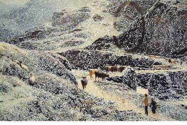
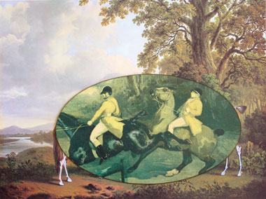
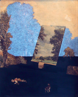
In one painting, oblong composition is split into white and black strips through which protrudes a tree, roof, road, cottage, bush, boys at a well, hat and some plants from the obliterated image. Drawing with white pen covers most of another image, allowing cows, a bridge and two figures to stay as remnants of the reproduced image. Men in hats are silhouetted by smooth white paint. A group wears masks. A large, nightmarish moonlit landscape has details that may or may not be the left over from the ‘original’ reproduction. A horse is painted over by a skeleton in white. Pale blue almost masks over a Dutch landscape, with a windmill and dancing peasants. Scenes redolent of happy compositions, now separated from their context, are fore grounded by suppression of the rest into an abstract field of one hue. The hand of the master over the reproduction of another’s work visits the discourse about originality, about reflexivity, respect and critique, disobedience and recycling. At first I dismissed them as a joke. Looking longer and more intensely, the way de Búrca re-composed the de-composed composition radiated visual intelligence, wit and wisdom. I particularly enjoyed his use of a rectangle that easily transformed into an easel placed in the abstracted, obliterated image carrying the fragment of the original, in this case not the original painting but the reproduction of one. These twists and turns enriched the optical play between the old role of detail and the new. The descriptive, narrative, true-to-appearance detail was fore grounded by a complete absence of detail in the areas obliterated by de Búrca’s abstract cover-up. Even the brushstroke was not legible.
 |
| Benjamin de Búrca: from Journey’s end ; courtesy the artist |
 |
| Benjamin de Búrca; from Journey’s end; courtesy the artist |
A seed of zero is interpreted to mean that no seed is specified, which means that each execution of the model could result in distinct data. And that was the case.
Slavka Sverakova is a writer on art.